Des valeurs et des couleurs bisontines
La marque a été co-créée par les acteurs à partir des éléments qui font l’essence du territoire.
Un positionnement audacieux
La fabrique du bonheur
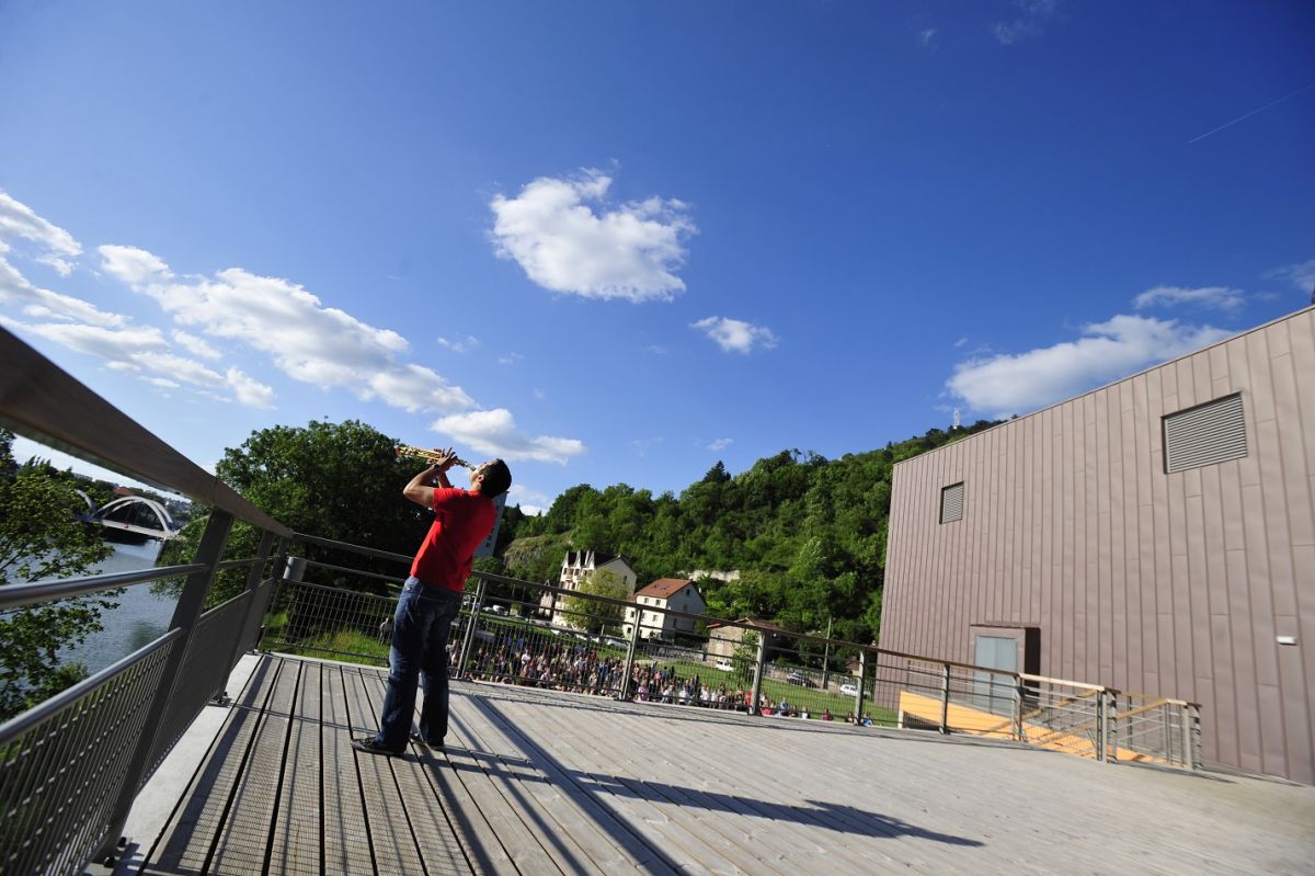
Besançon et son agglomération offrent tous les ingrédients du bonheur : de l’espace, du temps, une nature omniprésente et inspirante, des belles rencontres, des opportunités, des savoir-faire uniques, un dynamisme économique porteur d’avenir.
À chacun d’inventer sa recette, dans cet écosystème créatif : seul ou à plusieurs, pour se libérer ou se ressourcer, pour réaliser ses rêves ou faire grandir ses projets, pour un jour ou pour toujours…
Sur cette terre d’effervescence, les envies, les idées, les initiatives prennent vie, chacun trouvant ici un terreau fertile pour s’épanouir.
Ici, l’expérience du bonheur est à portée de tous.
Le concept de la marque
Une signature qui sonne
Boosteur de bonheur
2 mots de 2 syllabes, une allitération en b et une résonnance sonore en -eur, le tout engendre une mémorisation aisée.
Le mot Boosteur, francisé, pour traduire la dynamique du territoire, la valeur ajoutée qu’il peut apporter à tout individu qui souhaite faire émerger ses projets. Et bonheur, parce qu’ici, il est accessible et qu’il est l’objet des aspirations individuelles et collectives de notre temps.
Un logotype lettrine
Le choix d’une lettrine moderne pour étendard, avec ce b en deux modules qui lui apportent mouvement et équilibre. C’est le b de Besançon, c’est un pont se reflétant sur le Doubs, ce sont deux parties qui se rejoignent formant un tout, une harmonie.
Son design épuré, sa sobriété reflètent aussi bien la douceur du territoire, que sa modernité et son dynamisme économique. Sa composition en deux modules, quant à elle, traduit la simplicité des relations humaines et le faire-ensemble bisontin.
Accompagné d’une typographie retravaillée dans le style du logo pour infuser ce caractère identitaire dans l’ensemble de nos supports de communication.